Brand Customization
Billsby can be fully customized to appear native to your brand, so that whenever a customer is interacting through Billsby it's your brand identity that they'll see. We offer two lots of brand customization settings; one for the checkout and self-service account management screens, and one for your emails, invoices and credit notes.
Checkout and self-service brand customization
For customers who use Billsby screens to checkout a subscription or manage their current subscription, you can customize what colours, font, and rounding will be displayed so that they feel as though they've never left your website or app.

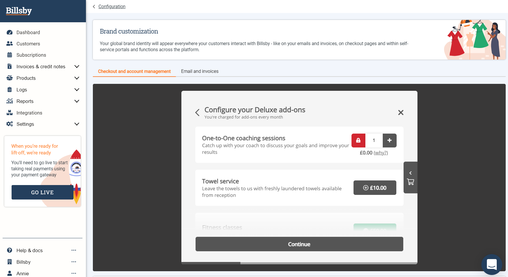
Checkout and account management preview box
The preview box at the top of the page displays any changes that you make to your brand settings in real time and how they will appear to your customers. The preview also displays a standard example of an add-on selection screen that your customer may be sent to if their subscription allows them to add add-ons. Don't worry if you haven't configured any add-ons in your Billsby account, the brand settings will still be updated to the other screens in a way that is consistent with the preview.
Remember to hit, 'Update Brand Settings' after you've made any changes.

Checkout and account management brand customization
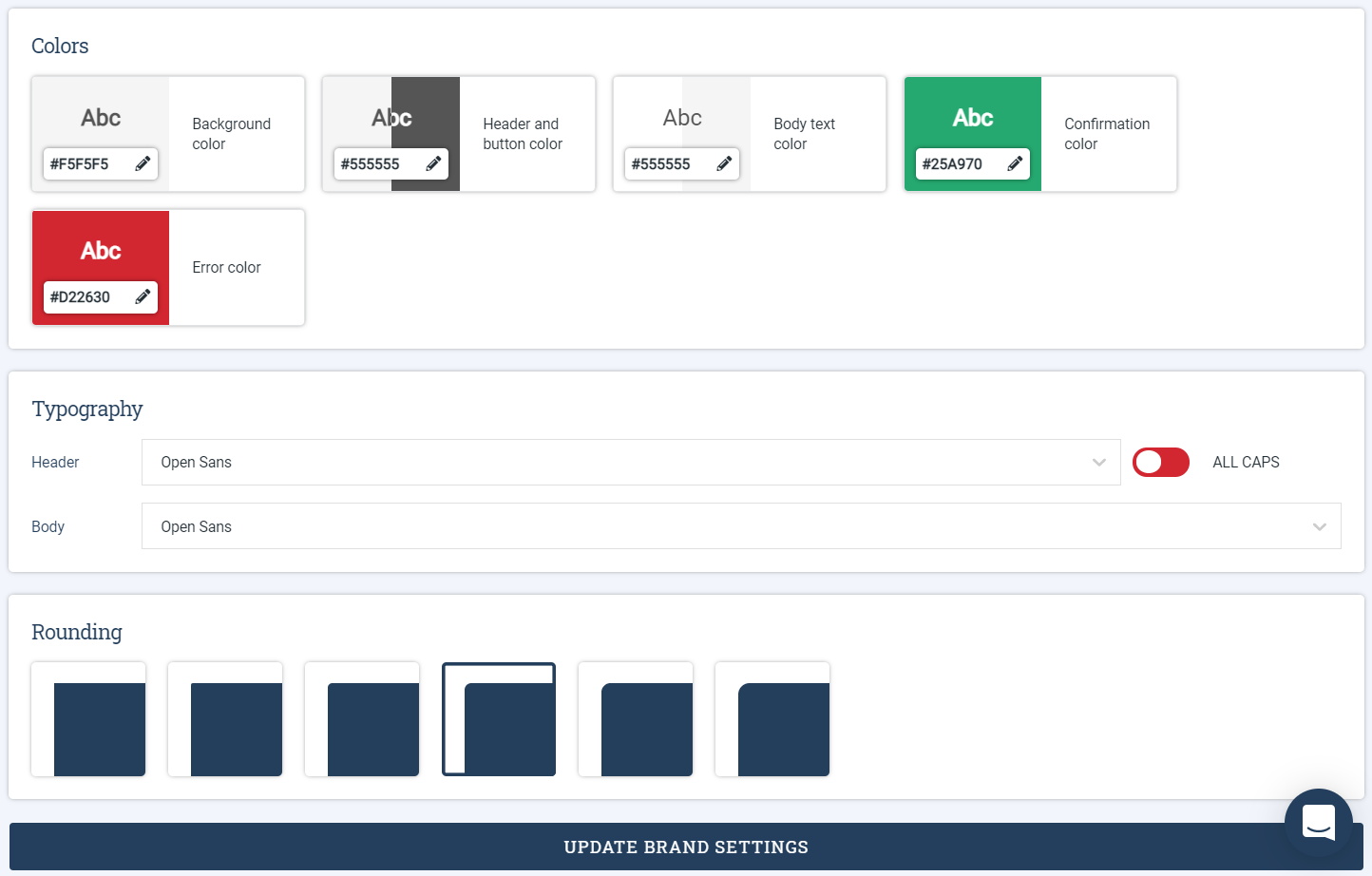
Colors
The colors you can customize and where they will be used, include:
- Background color - this will be used for the background of the modal, but not for the background of interactive sections within the modal. We automatically assign white for the background of interactive sections.
- Header and button color - headers will appear on both the modal background, directly on top of your chosen background color, and on interactive sections that have a white background. Any buttons not shown in a locked or confirmation state will be shown in the same color as your headers. If a button is disabled for any reason, we'll fade your chosen color down to 50% and use this for the button. All button text will be white, so we recommend using a darker button color so that the text will stand out.
- Body text color - body text will appear on both the modal background, directly on top of your chosen background colour, and on interactive sections that have a white background.
- Confirmation color - the confirmation colour will be used for buttons in a confirmation state, confirmation text as well as confirmation banners. When using your confirmation color for a banner, we'll fade the colour down to 20% for the banner's background and then use the color at 100% for any text on the banner.
- Error color - the error colour will be used for buttons in a locked state as well as for warning banners. When implementing the error color for a banner, we'll fade the colour down to 20% for the banner's background and then use the color at 100% for any text on the banner.
Typography
You can customize the font for your header and body text and choose whether you'd like for your headers to be in 'ALL CAPS' by hitting the toggle. Our supported fonts come from the Google Fonts library, so you have over 1000 fonts to choose from.
Rounding
As well as colors and fonts, we know that how a component looks is also an integral part of a company's brand identity. Because of this, you can choose a rounding setting for the checkout and account management modal, as well as its interactive sections and buttons.
Email, invoice and credit note brand customization
You can customize any email, invoice or credit note that is sent to your customer in relation to their subscription to make it consistent with your branding. This will avoid any confusion on the customers end regarding the legitimacy of the email. Likewise, you can determine the brand colours and logo that will be used in your emails, invoices and credit notes to match your website or app without making them feel like an add-on.

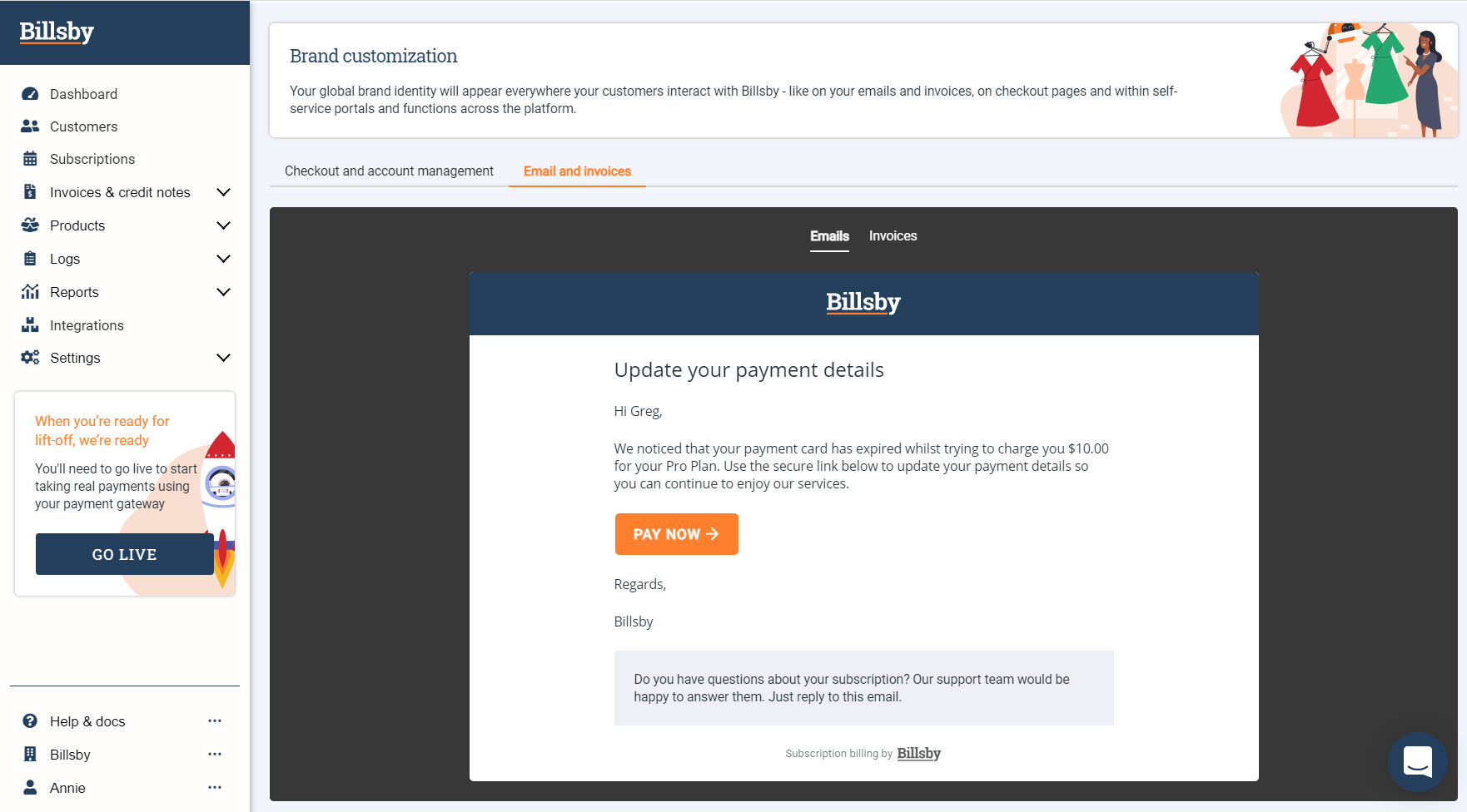
Email preview box
The preview box at the top of the page displays any changes that you make to your brand settings in real time and how they will appear to your customers when they receive an email notification or invoice from Billsby.
Remember to hit, 'Update Brand Settings' after you've made any changes.

Email brand customization
Colors
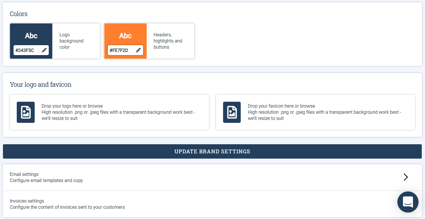
The colors you can customize and where they will be used, include:
- Logo background color - your logo will sit on top of this color. Remember that you'll want to clearly see the logo over the background color so, either a light logo and a dark background color, or a dark logo with a light background color will work best.
- Headers, highlights and buttons - you can choose a colour for all headers, highlights and buttons that appear within emails, invoices and credit notes. Headers and highlights will sit on a white background and all button text will also appear in white, so it's wise to make sure you select a color that will stand out.
Your logo and favicon
Here, you can upload your logo as a vector file and we will use it instead of our own in all correspondence and Billsby powered screens, such as checkout.
You can also upload a favicon. This is the small icon that will appear in the web browser whenever a customer is directed to a branded page.
Updated almost 4 years ago
